User Documentation
Intro
Thank you for purchasing Mino WordPress theme!
Mino is very unique theme, it will help you managing your content at the WordPress sites and create stunning layouts in few minutes without coding. Mino theme comes bundled with simple yet powerful page builder to help you create complex layout with ease. This doc is intended to help you get up and running with Mino page builder with no time.
Getting Started
Theme Installation
To install Mino theme is very easy :
1. Buy and download the theme from tonjoostudio : https://tonjoostudio.com/product/mino-clean-responsive-wordpress-theme/
2. Go to admin dashboard >> appreance >> theme >> add new >> upload
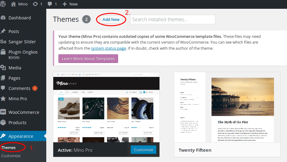
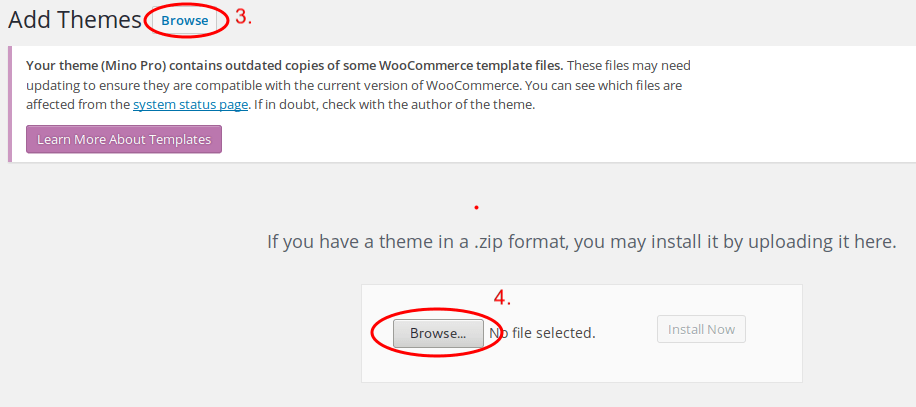
3. Go to your admin dashboard >> appreance >> theme
4. Activate Mino theme
5. Done!
Building a Page
I’m assuming you’ve already read the getting started guide. This guide will help you with the more advanced concepts of building a page using Page Builder.
Adding a Row
Rows form the overall structure of your page layout. These are the first things you will add to your page. To add a row, click on “Add Row.”
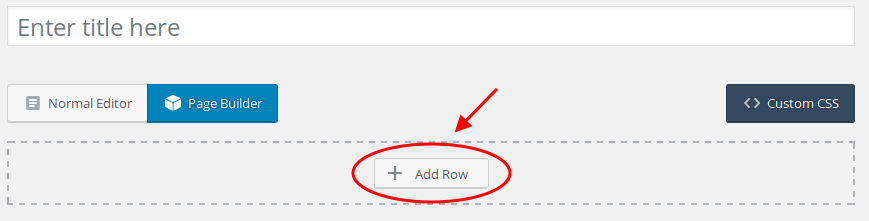
An “Add New Row” dialog will appear.
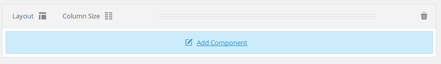
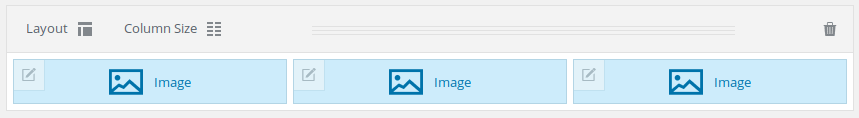
Row Options
Row consists of three options, layout, column size and delete. These three options can help you to manage your rows easily.
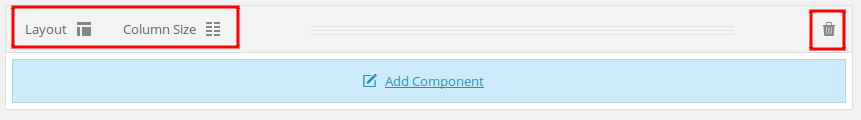
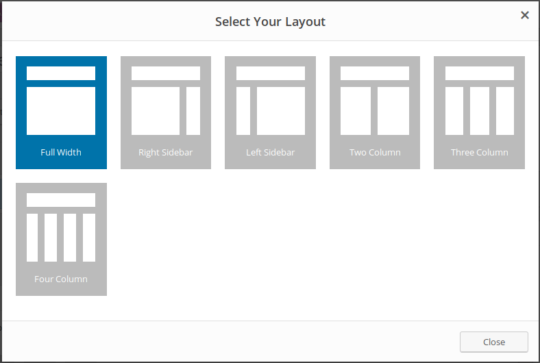
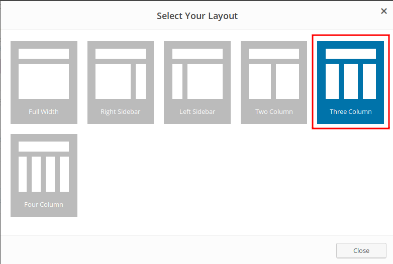
A. Layout
You can choose one from six different layout for your row. This is the basic setting for your row. The default layout is full width.
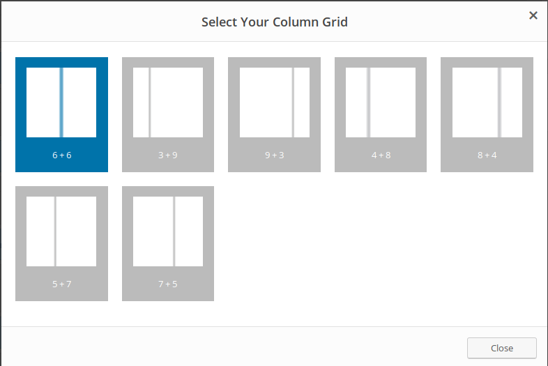
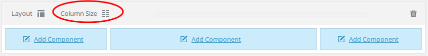
B. Column Size
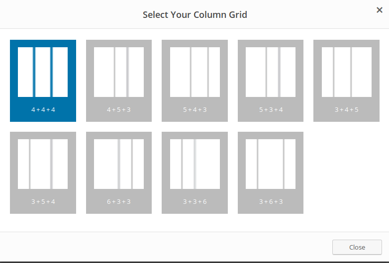
Column size is really depend on layout. If your layout is grid based, more than 2 grid, then column size will follow its settings
C. Delete
It’s for deleting your row. Please make sure you check your row before deleting it. You cannot undo the action.
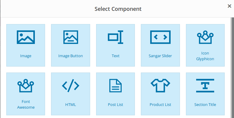
Adding a Component
components are the main features of the page builder. Component function almost like widgets on the theme. Mino’s Page Builder consists of 12 components that you can use for your layout. I will explain one by one the components contained in the Mino theme.
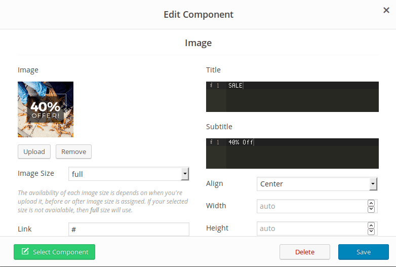
Component - Image
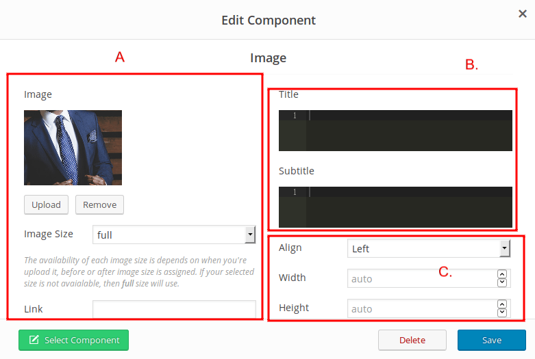
With this component, you can add static image to your layout. The image is full-width by default, but you can also set the width and height manually.
- A. Image : You can upload your image, set the size and link to it.
- B. Title : Type your component title and sub-title
- C. Position and Size : Set your image position and size. The default size is full-width.
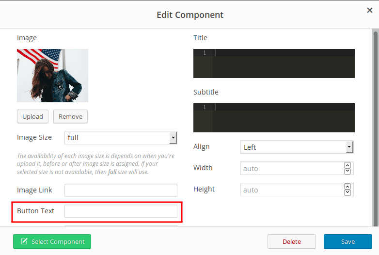
Component - Image Button
Almost like the Image, but in this component you can add a button on your image. The other settings is just remain same with image:
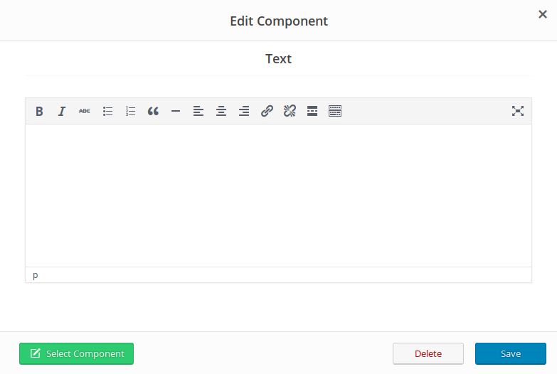
Component - Text
Text allows you to insert rich text and media objects in your page with no hassle. Use text component if you want to display text or paragraph, with complete WordPress editor.
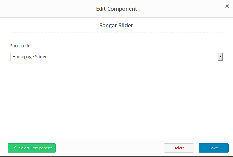
Component - Sangar Slider
Sangar slider is part of the mino theme bundle. Sangar slider is one of our premium plugin that can help you to make powerful and beautiful slider easily. Before using this component, you must create a slider on the sangar slider first, and choose the slider from the component. You can find sangar slider tutorial here : http://pustaka.tonjoostudio.com/plugins/sangar-slider-codex/
Component - Glyphicon
You can add a component of glyphicon icon from twitter bootstrap. Just choose the icon you want to use from icon dropdown menu, and set the title, subtitle, and content to fit your needs

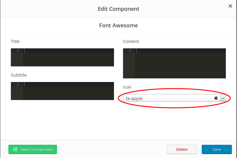
Component - Font Awesome Icon
If you are not a fan of default bootstrap icon (glyphcon) and prefer Font Awesome more, then we provide you are in a good hand. Font Awesome is the most popular font icon with many userbase. We provide the font awesome icon component for you. The settings is just like glyphicon, but the icon is font awesome instead.
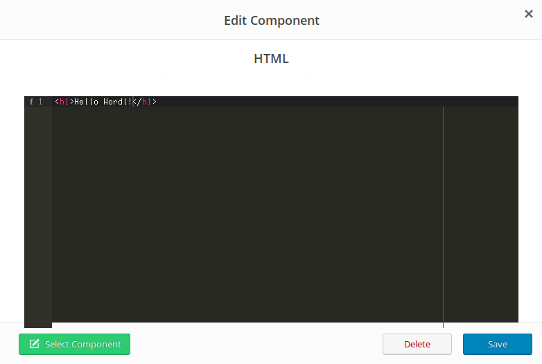
Component - HTML
If you need more power and controll of your component, you can always use HTML. Mino theme provide HTML component for “techies” to take controll of their component, as they wish. Just type your HTML in the editor, and you good to go
Component - Post List
Post list is a component for displaying your post/blog list. The list display is depend on your row columns setting (already mentioned before at the begining of doc).
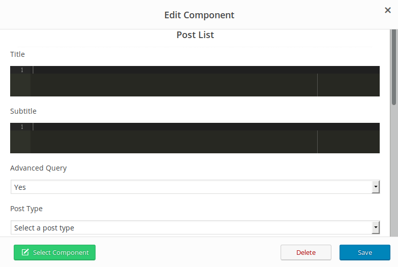
- A. Title & Subtitle : Type your component title and sub-title
- B. Advanced Query : Select YES if you want to display post list based on certain category or tags
- C. Post Type : Select the post type you want to display
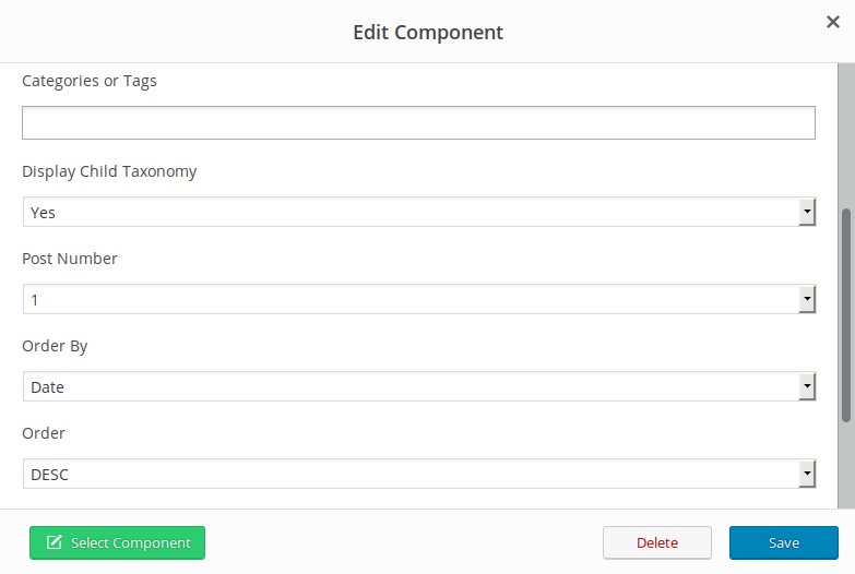
- D. Categories or Tags : Choose what post list you want to display based on its category or tags
- E. Display Child Taxonomy : Select YES if you want to display child taxonomy/category
- F. Post Number : How many posts you want to display? Set it in Post number
- G. Order by : Choose to order the post list by date, title, modified date and comment count
- H. Order : Set the order decending or acending
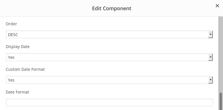
- I. Display Date : Display post date
- J. Custom Date Format : Choose to set custom date format
- K. Date Format : Type in your date format, if you choose to using Custom Date Format
Component - Product List
Product List is similar to Post List, but it’s Products instead. You can display all of your products to make it like live catalog. Please note that you need WooCommerce plugin installed to make this component working. You can download WooCommerce plugin from its official web page
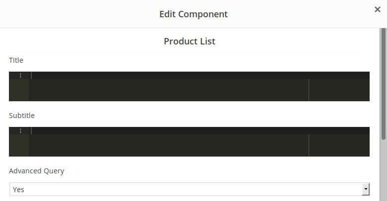
- A. Title & Subtitle : Type your component title and sub-title
- B. Advance Query : Select YES if you want to display post list based on certain category or tags
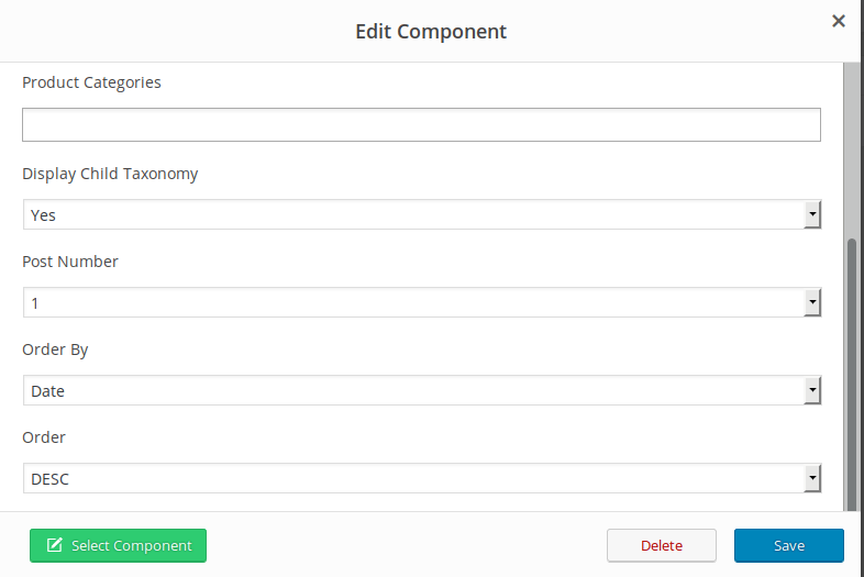
- D. Product Categories : Choose what products you want to display based on its category or tags
- E. Display Child Taxonomy : Select YES if you want to display child taxonomy/category
- F. Post Number : How many posts you want to display? Set it in Post number
- G. Order by : Choose to order the post list by date, title, modified date and comment count
- H. Order : Set the order decending or acending
Component - Section Tittle
Use section title component if you want to create large heading text for your section. Section title option is very simple and straightforward, and very easy to understand
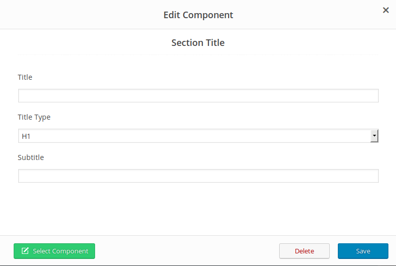
- A. Title : Type your text title
- B. Title Type : Choose your title heading size/type
- C. Subtitle : Type your subtitle
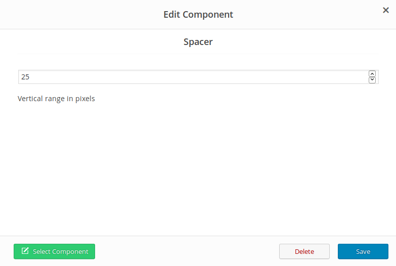
Component - Spacer
Spacer is a functionality to create vertical spacing (padding) between your component. Spacer using pixels as a measure.
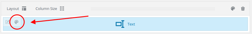
Columns Settings
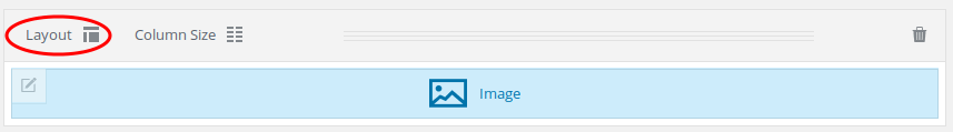
Column Setting is a set of features that allows you to setting your columns, such as class name, design, responsive options. With these feature, you will have more controll over your columns. I will explain one-by-one of its features. To add column setting, just add a component, and you will see column setting icon in top left of row component box :
Columns Settings - General
In General tab, you will see Extra Classname option. Use this option if you want add your own extra CSS class name in your column, for more controll over its style. Style particular content element differently – add a class name and refer to it in custom CSS.

Columns Settings - Design Options
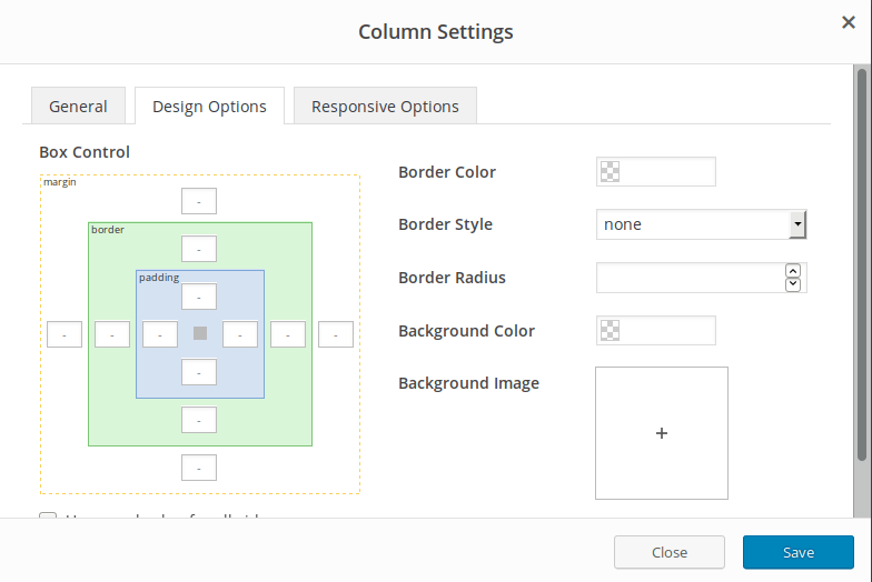
Design controll is fullset options and control for your column. You can customize its border, background, even padding and margin.
- Border Color : Change and set column border’s color
- Border Style : Set your column border style such as dahsed, solid, dotted, etc
- Border Radius : Set your column border radius
- Background Color : Didn’t like column default color? Change that to fit your need with Background Color
- Background Image : You can even add image to as a background to your column
- Background Pharalax : Tick if you want to set your Background Image as pharalax
- Box Control : Set your padding and margin control in pixel. And tick equal size if you want to set equal number and size for all padding/margin in your column.
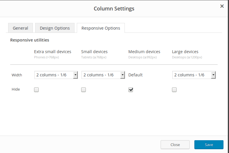
Columns Settings - Responsive Options
Use responsive options if you want more control over your columns reponsivenes. You can set individual width of your columns from 1 to 12, and hide certain with tick its width :
Tutorial
How to create Multiple Column component
It’s very easy to create multiple columns or grid based component. Please follow these steps :
1. Click add Component, choose what component you want to use. At this example, we will use Image component
2. Fill in all settings form to fit your needs :
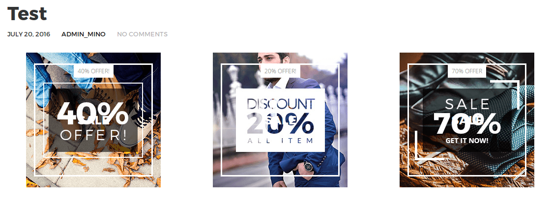
3. After that, click “Layout” and layout dialog will pop up. And choose your desired layout. At this example, we wil use 3 column layout/
4. Don’t forget to set the column size/grid, to make our component become more orderly and neat.
5. And this is our final result :